8 Layouts that are extremely trendy when it comes to website design
In case you are looking to create a new website or revamp an existent one, you must know that the website design you choose should not just impress, but also feel and work great. In terms of improved functionality, a responsive website design is probably one of the best investments you can make in the design of your website. Considering the increasing number of mobile users worldwide and the fact that search engines appreciate responsive websites, this is one step it is worth making. But, when it comes to the looks and feel of your website, what can you choose? Do take a look below at the 8 most trending layouts in this particular sector.
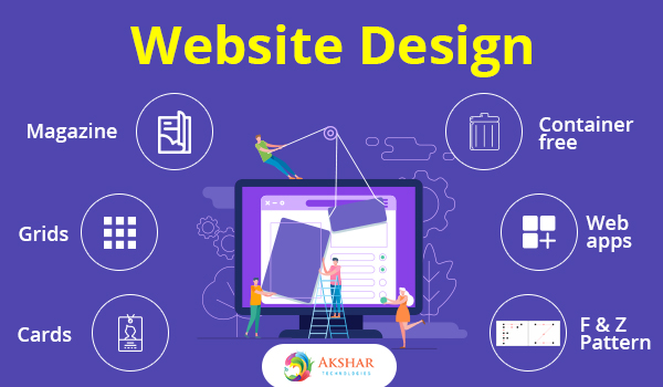
1. Cards
This type of layout is easy to notice in the case of social media websites, as it is easy to display news and other bits of information fast and easy. Facebook is a good example of this layout, as it uses cards to present the latest news on each user’s “wall”. When you find something interesting, all you have to do is click on the card and you’ll get additional details.
2. Grids
YouTube is a popular website that uses grids as its layout choice. It is similar to cards but allows the visitor to see more information at once with ease. This way, browsing for similar info becomes much easier, not to mention that it improves the design of a site.
3. Magazine
As you can tell, this particular layout is mostly used by blogs and other websites that have large chunks of information to share. Just think about the design of Time’s website and you’ll know what we mean.
4. Container-free
In case you are a follower of minimalism, there are high chances that you will appreciate this layout. What does container-free mean? It means that your website design will take out any unnecessary details, leaving behind a clean and easy to follow web page. Although it may seem flat, Apple loves this particular website design and has been using it for years.
5. Web apps with one-single page
This option makes reference to the fact that one single page is sometimes better than navigation on multiple pages. Navigation on such web pages becomes even better if you do something to improve the scrolling experience of your visitors. To get an idea about it, take a look at Tumblr.
6. F pattern
The websites that have loads of text used this type of layout in recent years. This is due to the fact that users responded better to websites with heavy text that used this kind of website design. Believe it or not, this is due to the fact that our brains are naturally programmed to easily scan F patterns. Thus, news websites are usually the ones that adopt the F pattern layout.
7. Z pattern
This is another pattern that makes information scanning easier. What’s the difference between F and Z patterns? Well, if you need to find a way to effectively incorporate a call-to-action in the website, the Z pattern will allow you to do so with ease.
8. Asymmetry
So, what if not all things are properly aligned? Apparently, asymmetry is a good way to attract the attention of visitors in a positive manner. There are high chances that this design appeared out of the desire to do things differently and offer users something special, something that can’t be found elsewhere.
If you are looking for any consultation in WordPress Website Design and Development then you can give us a call at +1 (855) 984-1577 or you can drop us a mail at info@akshartechnologies.com.