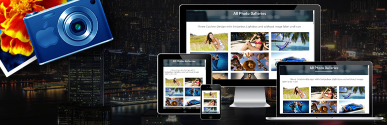
7 Tips To Create Better Responsive Photo Galleries
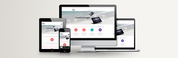
We all know and understand the importance of website designing on a responsive platform and that same is applicable for images and photo galleries.
It not good for websites having images in the wrong place or not into the appropriate size. It makes visitors thinking that the designer forgot something, or missed a step.
1. Consider Aspect Ratios
2. Size and Scale Consistently
3. Use a Slider or Gallery
4. Stay Away from Captions When Possible
5. Be Careful When Mixing Video and Images
6. Cut Unnecessary Elements
7. Use Only High-Quality Images
Conclusion
We all want to make user interactive websites and the strong images play a key part in that equation. It is also important that it should be properly visible into all the devices.
Always plan for images spaces that will work on every device and their size while wireframing stages of website design project. You might find that there are some give and take, in terms of image shape, but taking those early long run decisions and creating that consistency will surely benefit your website design in a long time.


